Editorial — November 6, 2026. A convincing demo can make software feel finished before anyone has asked what happens on the second visit. AI app builders make that gap especially easy to overlook: the interface appears, the buttons respond, and the idea suddenly looks like a product.
In a November 5 guide, Google describes turning a photographed sketch into an app with Gemini Canvas, trying the preview, and requesting changes conversationally. That is an appealing starting point. It is also the beginning of a product’s questions, rather than the end of them.
The picture cannot specify everything
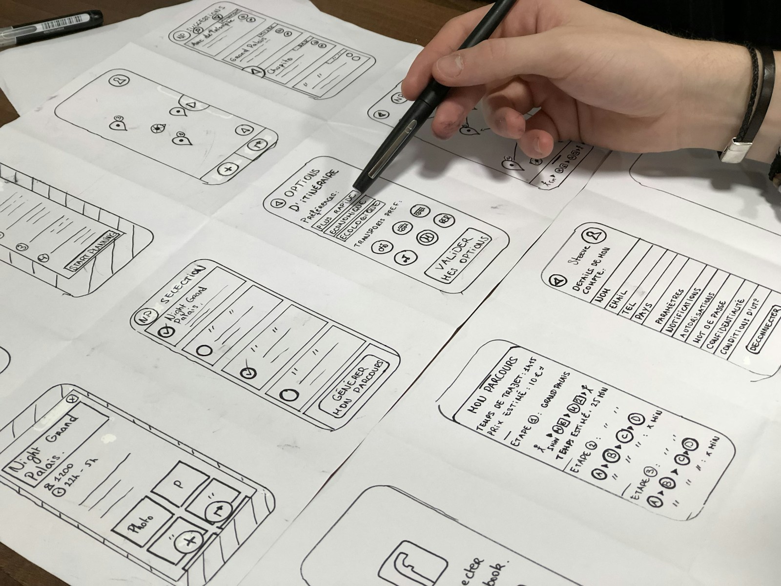
A sketch communicates intent. It can show a habit tracker with seven boxes, a shopping list with a large add button, or a small game with a score counter. It usually says very little about where information lives, what happens when an action fails, or how someone recovers from a mistake.
Those missing details matter even when the idea is modest. A tracker that forgets yesterday’s entries is a different tool from one that stores them. A shared list needs decisions about who can read and change it. A game needs rules for ties and restarts. Attractive screens cannot answer those questions by themselves.
This is not a finding that Gemini mishandles these cases. It is a standard we should apply to any prototype before relying on it. The person requesting an app still needs to define what dependable behavior means. Generating an interface does not remove that responsibility.
Test the boring journey
The useful next step is a short acceptance checklist written in ordinary language. Add an entry, change it, remove it, and reload. Try an empty field and an unusually long one. Return on a narrow screen. Navigate with a keyboard. If information must persist, decide where it should be saved and verify that behavior explicitly.
These checks should follow the promise being made. A disposable calculator may need no saved state. A private journal needs a much more careful account of storage and access. Treating every little experiment like a banking app wastes effort; treating every experiment like a disposable toy creates a different problem.
Keep the first test data fictional. Names, account details, and work documents are unnecessary when checking whether a form behaves sensibly. Before using real information, understand the relevant service settings and the app’s data path. A friendly interface is not evidence that information stays in a particular place.
The owner is part of the design
A successful prototype also needs someone who can explain its limitations. Who fixes it when an update changes its behavior? Is there an export or another way to recover important entries? Can the owner understand enough of the implementation to request a safe change? Those are product questions, even if the first version took minutes.
For a personal experiment, the answer may simply be that it is temporary and replaceable. That is a reasonable choice when made deliberately. Trouble begins when a quick experiment quietly becomes essential, while its backup and maintenance arrangements remain experimental too.
The best use of rapid app generation may be to make requirements easier to discover. A working preview lets someone notice that the delete button is too easy to hit or that the weekly view needs a different layout. Those discoveries are valuable precisely because the prototype is still open to revision.
Celebrate that speed, but measure readiness separately. Ask whether the app does what was promised, whether failures are understandable, and whether its data can be handled appropriately. The milestone worth reaching is not merely “it appeared.” It is “we know what it does, what it does not do, and what happens next.”
Featured photo: Amélie Mourichon / Unsplash, used under the Unsplash License. Stock photograph; not a product screenshot.